
Tigard Christian Church
ProfessionalLogo Design

- Project type
- Professional
- My role
- Graphic designer
- Deliverables
- Logo & visual identity
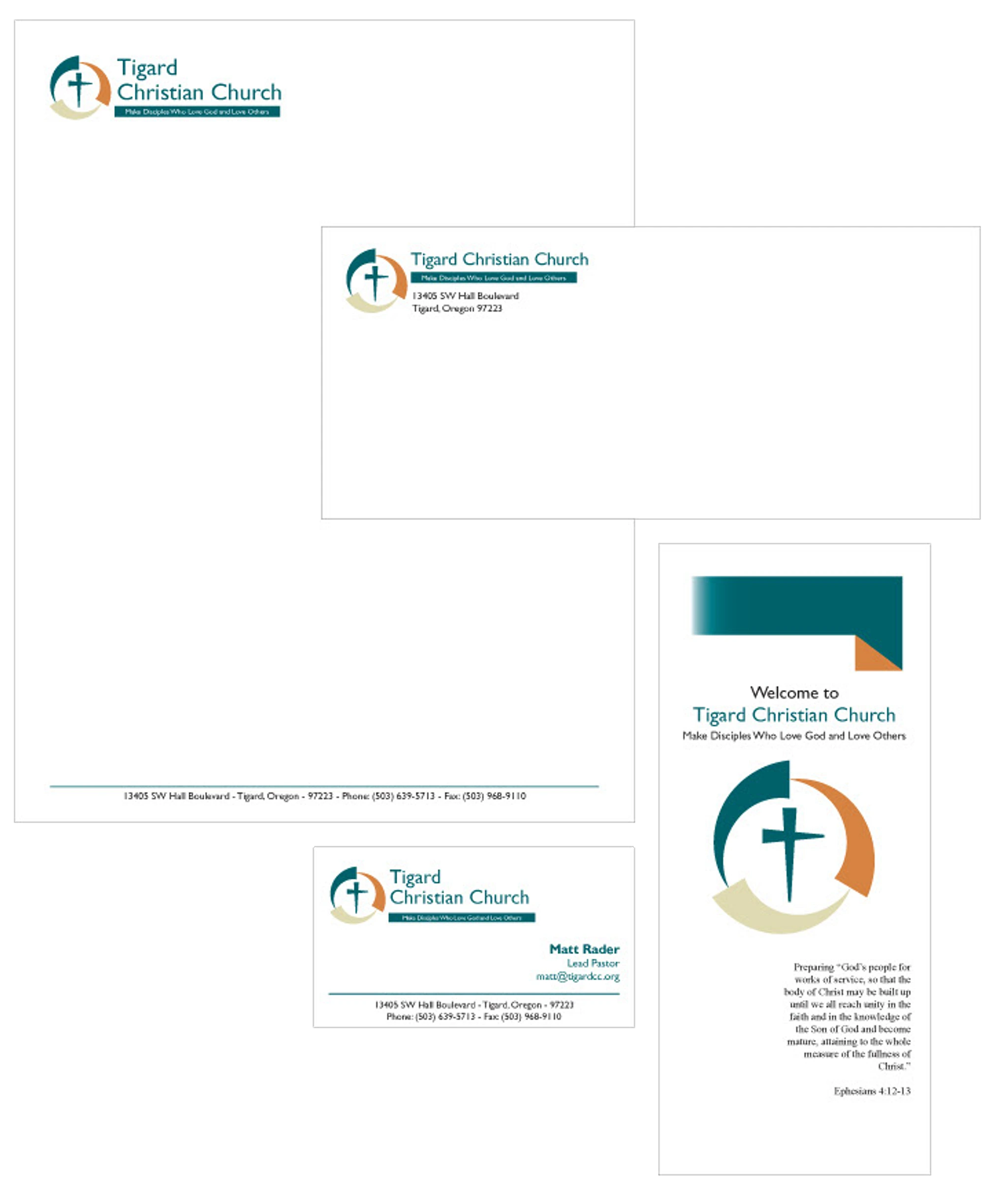
This project involved a complete rebrand for Tigard Christian Church, guided by the church’s stated ethos of growth through three interconnected principles: loving God, loving others, and making disciples. Rather than presenting these ideas as separate messages, the goal was to translate the concept into a unified visual system that communicated continuity, balance, and ongoing development.
The final logo uses three expanding elements arranged in a circular form to represent this cyclical relationship, with each element visually leading into the next. At the center, a cross formed from intersecting nail shapes references sacrifice while echoing the same geometric language used throughout the mark. This approach allowed the symbolism to feel intentional and cohesive, clearly grounded in the client’s values while remaining visually structured, balanced, and adaptable across applications.
Let’s connect.
If you have a project in mind, a potential collaboration, or just want to say hello, I’d be happy to hear from you. Whether it’s design work, creative problem-solving, or future opportunities, feel free to reach out.